Are we over all things Dark Mode yet? Not according to Apple. The technology titan launched a handful of new customization options for your iPhone and iPad home screens at WWDC 2024, leaning into phone owners’ hunger for personalizing their devices to suit their mood. When iOS 18 comes out to nearly every iPhone and iPad in the world this fall, the ability to go dark or bright or anywhere in between will come along with it.
Apple has been ramping up customization in iOS for some years now, a most-wanted change among iPhone and iPad owners who want more control over their device’s look and feel. This time around, these personalization options take on Android’s Material You design approach — and even leapfrog over it in some ways. I’ll explain what I mean and how the dark look and tinting in iOS 18 seem to work (we’ll know for sure when we test it out in person).
For more on Apple’s WWDC announcements, don’t miss how to install the iOS 18 Developer Beta and why you might want to hold off on installing it for now.
Apple’s new dark mode looks great at first ‘blush’
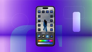
You’d think we’d be over getting excited about ‘dark mode‘ things at this point, but Apple proved us wrong today. Now when customizing your home screen, you’ll have four options to customize the look of your apps and widgets: automatic, dark, light and tinted. It wasn’t immediately clear from the keynote if automatic mode will change the look of your home screen according to a set time or between sunrise and sunset, where dark and light options are fairly straightforward.
From what I could tell, the new tinted option, however, looks the most dramatic and exciting. Apple demonstrated that when you choose the tinted option, you can set a specific color tint to be added across your entire home screen. You can also just let your iPhone do all the work, too and let it select a color from your wallpaper to become the tint color.
Yes, it does sound a bit like Material You on Android, but there is a difference between Google’s approach and Apple’s. Where iOS 18 looks like it will add a wash of color to your entire home screen, Google requires developers to support app icons to be themed, and there are still tons of apps that don’t support it yet.
In contrast, Apple appears to have made dark look and tint a system-level customization option that you yourself can choose and apply across backgrounds. While there may be exceptions, from what I saw in the keynote, the effect looks great.
My team and I will have to wait to get our hands on the beta to see if this tint extends to just some of your apps as Google’s Material You does, but even if it not, this is sure to be a people pleaser for those who are thirsty for more home screen customization.
For additional iOS 18 and WWDC details, see why Siri with Apple Intelligence is a big deal and how Apple schooled Google in talking about AI (at least for now).


